Website Speed vs. High-End Design: How to Have the Best of Both Worlds
In the digital landscape of 2026, a brand is judged in the first 500 milliseconds. This is the “Perception Window.” For high-end brands, this window presents a brutal paradox: Visual Grandeur vs. Technical Velocity.
On one hand, a premium brand requires high-fidelity imagery, complex motion graphics, and rich interactive layers to communicate luxury and authority. On the other hand, Google’s algorithms and modern user patience have zero tolerance for latency. A beautiful website that takes three seconds to load is, for all intents and purposes, an invisible website.
Solving this paradox is the hallmark of Technical Precision. It is no longer enough to be a “graphic designer” or a “web developer.” To dominate the 2026 market, you must be a Digital Architect capable of balancing the aesthetic “heavy lifting” with invisible, high-speed infrastructure.
1. The Psychology of Loading: Why Speed is a Brand Value
In the mind of the consumer, speed is synonymous with competence. When a site loads instantly, the brain registers a “frictionless” experience, which translates directly into Brand Trust.
- The Frustration Threshold: Research shows that even a 100-millisecond delay can decrease conversion rates by 7%.
- Cognitive Ease: High-end design is intended to inspire; however, if that inspiration is interrupted by a “loading spinner,” the emotional connection is broken. The user moves from a state of “Awe” to a state of “Annoyance.”
- SEO Sovereignty: In 2026, Core Web Vitals (Google’s speed metrics) are the primary gatekeepers of organic traffic. You cannot scale a “Growth Frankenstein” if your foundation is built on slow, unoptimized code.
2. Strategic Asset Optimization: The Invisible Foundation
The secret to having a “Best of Both Worlds” website lies in how assets are handled before they ever reach the browser.
Next-Gen Image Formats
High-end design requires custom photography and 3D mockups. In 2026, using JPEGs or PNGs is a technical liability.
- WebP and AVIF: These formats provide high-fidelity visuals at a fraction of the file size.
- Dynamic Sizing: A high-impact online presence uses “Responsive Images,” serving a 6-inch smartphone a different file than a 27-inch monitor, ensuring no wasted bandwidth.
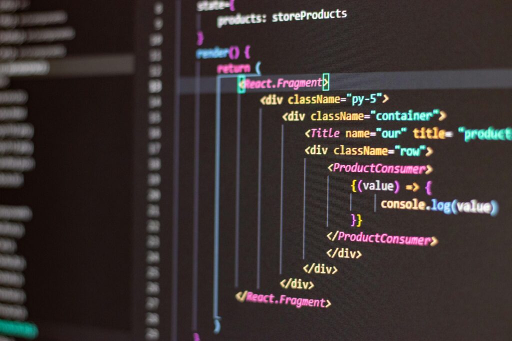
The Power of SVG and Code-Based Design
Instead of using heavy image files for icons, logos, and geometric shapes, professional architects use Scalable Vector Graphics (SVG).
- Resolution Independence: SVGs look perfect on a Retina display but weigh less than a single kilobyte.
- CSS Animations: Rather than using heavy video files for every movement, we use CSS and JavaScript to create Motion Graphics that are rendered by the user’s browser in real-time, resulting in zero-latency animation.
3. High-Fidelity Prototyping: Testing Speed in the Blueprint
At SOUTECH Multimedia, we don’t believe in “fixing speed later.” We build speed into the 15-screen high-fidelity prototype.
By prototyping the user flow, we identify where “asset-heavy” sections (like 3D environmental renders) are located. We then architect the site to use Lazy Loading—only loading the high-end visuals as the user scrolls toward them. This ensures the initial “above-the-fold” experience is lightning-fast, while the full grandeur of the design unfolds seamlessly.
1. Identifying “Asset Velocity” in the User Flow
A high-fidelity prototype acts as a stress test for your brand’s digital weight. During the creation of a 15-screen flow, we map out every heavy element—be it a 4K hero video, a complex 3D product mockup, or a high-resolution gallery of custom photography.
- The Load-Order Strategy: By visualizing the journey, we decide which assets are “mission-critical” for the first 500 milliseconds.
- The Above-the-Fold Priority: We architect the prototype so that the initial screen (what the user sees without scrolling) is technically lightweight, ensuring an instant “Handshake” with the user, while heavier brand storytelling elements are queued for later.
2. The Mechanics of “Lazy Loading” Architecture
Lazy loading is the technical art of “just-in-time” delivery. Through high-fidelity prototyping, we define the exact trigger points for these assets.
- Seamless Grandeur: As the user scrolls down to learn about your “Cybersecurity Licensing” or “Renewable Energy Solutions,” the high-end 3D renders “wake up” and load just before they enter the viewport.
- Perceived Speed: This technique tricks the brain. Because the site responded instantly to the first click, the user perceives the entire site as fast, even if it is housing gigabytes of high-fidelity data below the surface.
3. Avoiding the “Growth Frankenstein” of Bloated Code
When speed isn’t prototyped, developers often resort to “patchwork” fixes—adding more plugins or scripts to try and optimize a heavy site. This creates a “Growth Frankenstein” of conflicting code that eventually breaks.
- Blueprint Precision: By defining the asset architecture in the prototype phase, we provide a clean, technical blueprint for developers. They know exactly which images need to be WebP and where CSS-based animations should replace heavy GIF files.
- Reduced Friction: This proactive approach eliminates the “Design vs. Dev” conflict. The designer ensures the brand remains premium, and the architect ensures the site remains fast.
4. Perspective Testing Across Devices
A prototype allows us to test “Speed Perception” on a 6-inch smartphone versus a desktop.
- Adaptive Delivery: In our 15-screen flows, we prototype how the site behaves on a slow 4G connection in Abuja versus a high-speed fiber line. We can then architect “fallback” states—where a site might show a high-quality static image instead of a video if the connection speed is low—preserving Brand Trust in all conditions.
Architect Your Fast-Track Future with SOUTECH Multimedia
At SOUTECH Multimedia, we understand that in 2026, Time is the New Luxury. We don’t just build beautiful sites; we build high-performance engines for your brand. Since 2010, we have been the premier destination for entrepreneurs and firms who demand technical precision and aesthetic excellence in equal measure.
Our Speed-Integrated Prototyping Includes:
- 15-Screen High-Fidelity Simulations: A full interactive map of your digital speed and flow.
- Lazy-Loading Strategic Planning: Ensuring your heavy 3D assets never slow down your first impression.
- Asset-Light Premium Design: Leveraging next-gen formats and SVG architecture for maximum clarity at minimum weight.
- Global Performance Oversight: Ensuring your brand narrative remains consistent and fast across every continent.
4. The “Growth Frankenstein” vs. Lean Infrastructure
A common pitfall for traditional businesses moving online is the “Plugin Trap.” They add a plugin for every feature, leading to a “Growth Frankenstein” website—a disjointed mess of conflicting code that drags down performance.
- Clean Code Architecture: A multimedia partner provides custom-coded solutions that eliminate “bloatware.”
- CDN Integration: By using Content Delivery Networks, your high-end design assets are stored on servers in Abuja, London, and New York simultaneously, ensuring that a user in Nigeria gets the same high-speed experience as someone in the US.
5. Mobile-First Luxury: The 6-Inch Challenge
In 2026, luxury is experienced on a mobile device. High-end design must be “fluid.”
- Technical Precision: We use “Adaptive Bitrate Streaming” for background videos, ensuring that if a user is on a slow 4G connection in a rural area, the video scales down invisibly to prevent buffering, rather than stopping the experience entirely.
- Micro-interactions: Small, fast animations provide immediate feedback, making a site “feel” faster than it actually is.
6. Conclusion: The Architect’s Mandate
You do not have to choose between a beautiful website and a fast one. In the hands of a skilled Brand Architect, speed is the canvas upon which high-end design is painted. By focusing on Technical Precision, Strategic Asset Optimization, and High-Fidelity Prototyping, you create a digital presence that is as powerful as it is beautiful.
Experience Performance-Driven Design with SOUTECH Multimedia
Is your current website beautiful but slow? Or fast but forgettable? At SOUTECH Multimedia, we specialize in the “Science of the High-Impact Presence.” Since 2010, we have been the premier partner for entrepreneurs and firms who refuse to compromise.
We act as your “One-Stop” multimedia partner, ensuring your brand identity is consistent, cohesive, and—above all—lightning fast.
Our High-Performance Services Include:
- Premium Brand Identity & Web Design: High-fidelity visuals optimized for 2026 speed standards.
- UI/UX High-Fidelity Prototyping: Detailed 15-screen flows that prioritize performance and user trust.
- Smart Label & 3D Packaging Design: Bridging the physical and digital worlds with zero-latency AR and QR tech.
- Omni-Channel Consistency: Eliminating the “Growth Frankenstein” through strategic, clean-code architecture.
- A Decade of Excellence: Trusted by tech leaders and MSMEs since 2010.
Stop choosing. Start winning.