
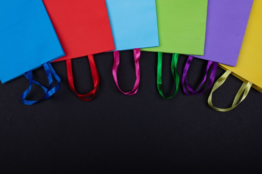
Color Psychology in Retail: Choosing Packaging Colors that Sell
In the retail space, your packaging is your most effective salesperson. Because human beings process visual information—specifically color—in milliseconds, the colors you choose for your packaging do the “heavy lifting” of your marketing before a customer even reads a single word.
At SOUTECH Multimedia, we don’t just pick colors that “look nice.” We use color as a strategic tool to influence perceptions, set expectations, and trigger the subconscious impulses that lead to a sale.
The “Three-Second” Rule of Color
Research shows that up to 90% of a consumer’s snap judgment about a product is based on color alone. Within seconds, your packaging needs to answer three fundamental questions for the shopper:
-
What is this? (Does the color match the product category?)
-
Who is this for? (Does the aesthetic appeal to my demographic?)
-
What is the value? (Is it luxury, economy, natural, or synthetic?)
Decoding the Spectrum: What Colors Signal
Understanding the psychological triggers of specific hues allows you to align your packaging with your brand’s promise.
| Color | Emotional Triggers | Industry Best Use |
| Red | Urgency, excitement, appetite | Food, snacks, impulse sales |
| Blue | Trust, reliability, calm | Tech, healthcare, finance |
| Green | Health, growth, sustainability | Organic food, eco-products, wellness |
| Yellow | Optimism, warmth, attention | Playful brands, clearance, youth |
| Orange | Confidence, friendliness, fun | Adventure, creative, affordable |
| Purple | Luxury, exclusivity, creativity | Premium goods, indulgence |
| Black | Power, sophistication, mystery | High-end luxury, electronics |
| White | Cleanliness, purity, simplicity | Medical, beauty, modern tech |
Strategies for Strategic Color Selection
1. Disrupting the “Category Norms”
Every retail aisle has a “norm.” For example, organic products are almost always green and white. While following this norm helps you signal “category relevance,” breaking it can help you stand out.
-
The Pro Approach: Analyze your competitors. If the entire aisle is green, a bold, sophisticated black or a clean, minimalist white label can make your product pop as the “modern” alternative.
2. Consistency as a Trust Signal
Color is the most powerful tool for brand recognition. When a customer can identify your product by color alone, you have created a mental shortcut that drives repeat purchases.
-
The Pro Approach: Once you choose your signature palette, be ruthless in your consistency. Use the exact same hex codes and print profiles across your website, social media, and every single physical product in your line.
3. Demographic-Centric Design
Color associations are not universal; they are deeply tied to demographics and culture.
-
Children: Respond best to high-contrast, vibrant primary colors (reds, yellows).
-
Young Adults: Lean toward authentic, socially aware, and on-trend palettes.
-
Older Demographics: Generally prefer more refined, muted, and sophisticated tones that signify quality and stability.
4. Creating Multi-Sensory Connections
Color shouldn’t exist in a vacuum. It should work in tandem with your product’s scent, texture, and function.
-
The Pro Approach: If you are selling a scented candle, the packaging color should naturally “match” the smell (e.g., earthy greens for pine, soft purples for lavender). This creates a cohesive sensory expectation that builds consumer confidence.
How SOUTECH Multimedia Elevates Your Brand
At SOUTECH Multimedia, we help you move beyond “favorite colors” and into “conversion colors.” Our design process involves:
-
Market Audit: We analyze the visual landscape of your competitors to find the “white space” where your brand can stand out.
-
Psychology-Based Design: We map your brand attributes (e.g., “premium,” “reliable,” “energetic”) to scientifically backed color palettes.
-
Consistent Execution: We ensure your colors look identical on a screen, on a label, and on a printed box, protecting your brand’s integrity.
Ready to Claim Your Shelf Space?
Your product is better than the competition—is its color palette telling that story? Don’t let a sub-par color choice hide your potential. Let us help you craft a visual identity that demands to be picked up.
Let’s design a product that looks as good as it performs.
-
Visit Us: soutechmultimedia.com
-
Request an Audit: Contact our team today for a color strategy consultation.
-
Dominate: Let’s blend your brand’s mission with a visual design that drives sales.