The Hidden Science Behind Great User Experience Design
Most people think UI/UX design is about making things “look good.” Clean layouts, nice colors, modern fonts — that’s what many assume design is. But in reality, great UI/UX is not decoration. It is behavior design.
Every user interaction is driven by psychology. People expect systems to behave in certain ways based on past experiences. When your product breaks those expectations, even slightly, frustration builds quickly. And frustration leads to abandonment.
This is why structured UI/UX design is critical for any serious digital product.
At SOUTECH Multimedia, we start by understanding the user before designing anything. Our user research reports focus on behavior, needs, and expectations. We study what users are trying to achieve, where they get stuck, and what makes them disengage.
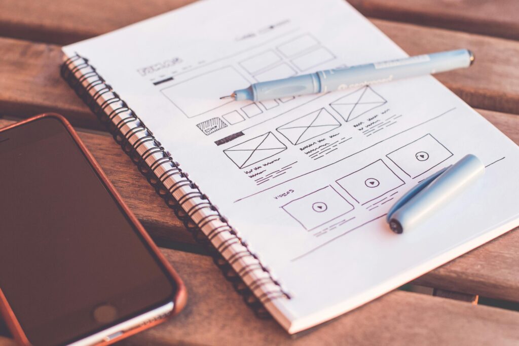
We then develop wireframes, which define structure and flow. Wireframes are intentionally simple because they force us to focus on logic, not visuals. If the structure is weak here, no amount of visual design can fix it later.
After that, we build prototypes — interactive models of the product. This stage is critical because it allows real users or stakeholders to test navigation and interaction before development begins. It is often here that major usability issues are discovered and corrected.
Once the experience is validated, we move to UI design, where we apply visual identity, typography, spacing systems, and responsive layouts across desktop, mobile, and web platforms.
To maintain consistency, we also create a complete design system: a structured library of reusable components, styles, and rules that guide future development and scaling.
The truth is simple: users don’t struggle because they are careless. They struggle because the design was not built around them. Great UX design reduces thinking. It reduces effort. It removes uncertainty.
And in a world where users can switch to a competitor in seconds, the product that feels easiest to use is the one that wins.
In the vibrant, high-velocity digital economy of 2026, the primary gateway to the internet for the average Nigerian is not a laptop or a desktop—it is the smartphone. From the bustling markets of Lagos to the tech hubs of Abuja, the mobile device is the “Command Center” of daily life. For businesses, this means that having a “responsive” website is no longer a competitive advantage; it is the bare minimum requirement.
At SOUTECH Multimedia, we have tracked this evolution since 2010. We’ve moved past the era of “Mobile-First” and entered the era of “Mobile-Intensive” design. To win the modern Nigerian consumer, you need an interface that isn’t just visible on a phone, but optimized for the way people actually hold, touch, and interact with their devices.
1. The Reality of the Nigerian Digital Landscape
Nigeria is home to one of the youngest and most mobile-centric populations on earth. In 2026, over 85% of web traffic in the country originates from mobile devices. These users are often multitasking—navigating traffic, waiting in lines, or managing businesses on the go.
The “Responsive” Trap
Many companies believe that if their website “shrinks” to fit a phone screen, they are “Mobile-Friendly.” This is a dangerous misconception.
- The Problem: Responsive design often just stacks desktop elements vertically. This leads to “Long-Scroll Fatigue,” tiny buttons that are hard to click, and slow load times on mobile networks.
- The Shift: Modern UX demands a “Thumb-Friendly” approach where the most important actions are within the natural reach of a user’s thumb.
2. The “Thumb-Friendly” Revolution: Design for Ergonomics
Human anatomy dictates how we use technology. Most people hold their phones with one hand and use their thumb for navigation. If your “Call to Action” or “Menu” button is at the top left of the screen, you are forcing the user to use two hands or perform an “Olympic-level” thumb stretch.
Key Principles of Ergonomic Design:
- The Bottom Navigation Bar: We prioritize placing the most important links (Home, Search, Cart, Profile) at the bottom of the screen, within the “Green Zone” of thumb reach.
- Target Size: In 2026, buttons must be at least 44×44 pixels. Anything smaller leads to “Fat Finger Syndrome,” where users accidentally click the wrong link and leave your site out of frustration.
- Swipe over Click: Users find it more natural to swipe through a gallery or a menu than to click tiny “Next” arrows.
3. Speed as a UX Feature
In Nigeria, data costs and network stability vary. A “Premium” brand in 2026 is one that respects the user’s time and data.
- Lightweight Assets: We utilize SVG graphics and optimized code to ensure that your site loads in under 3 seconds, even on a 3G or 4G connection.
- Lazy Loading: We ensure that only the content the user is currently looking at is loaded, saving them data and improving the “perceived speed” of your platform.
4. The Power of a Unified Design System
The biggest challenge for a growing business is Consistency. If your mobile app feels different from your mobile website, you lose brand trust. This is where the SOUTECH Design System comes in.
Why You Need a Design System:
- Scalability: As you add new features, you don’t have to “reinvent the wheel.” You use a library of pre-approved UI components.
- Efficiency: Your development team works faster because they have a “Rule Book” for how every button, form, and header should look and behave.
- Brand Authority: A unified look across all screens tells the consumer that you are a professional, high-tier organization.
5. Case Study: The Mobile-First Pivot
When we worked with a local retail aggregator, their mobile drop-off rate was 60%. Users were finding it impossible to complete the checkout process on their phones.
- The Intervention: We overhauled their UI using our Design System, moving the “Checkout” button to a persistent bottom bar and simplifying the form fields to be “Mobile-Keyboard Friendly.”
- The Result: Mobile conversions increased by 45% in the first quarter. We proved that users weren’t “not buying”—they were just “unable to buy” due to poor UX.
6. Beyond the Screen: Context-Aware Design
The “Modern Nigerian Consumer” isn’t just using a phone; they are using it in a specific context.
- High-Glare Environments: We ensure your color contrast is high enough to be read in the bright Nigerian sun.
- Dark Mode Optimization: In 2026, many users prefer “Dark Mode” to save battery and reduce eye strain. Our UI designs include native Dark Mode themes.
In the world of UI/UX, “Context-Aware Design” is the transition from designing for a device to designing for a human being’s actual environment. In Nigeria, the “context” involves unique physical and technical realities—ranging from the intense tropical sun to the need for power conservation during long commutes.
At SOUTECH Multimedia, our 14 years of experience have taught us that a digital product is only as good as its performance in the “wild.” Here is an expansion on how we design beyond the screen to meet the specific needs of the modern Nigerian consumer:
1. Mastering High-Glare Environments (The “Outdoor” UX)
Nigeria is one of the sunniest regions on earth. If a user is trying to make a quick bank transfer or check a delivery status while standing on a bright street in Wuse Market, a low-contrast design will fail them.
- The Contrast Ratio Strategy: We don’t just guess which colors work; we adhere to the Web Content Accessibility Guidelines (WCAG) 2.1. We ensure that text-to-background contrast ratios are high enough (at least 4.5:1) so that the content remains legible even under direct sunlight.
- Anti-Glare Typography: We avoid thin, spindly fonts that “wash out” in bright light. Instead, we use bold, medium-weight typography that maintains its shape and clarity against high-glare backgrounds.
2. Dark Mode Optimization: More Than Just an Aesthetic
In 2026, Dark Mode isn’t just a “cool feature”; it is a functional necessity for the Nigerian market.
- Battery Conservation: On modern OLED and AMOLED screens (which many Nigerians use), true black pixels are actually “off,” meaning they consume zero power. In an environment where power supply can be inconsistent, a well-designed Dark Mode can extend a user’s battery life by up to 30%.
- Reducing “Digital Eye Strain”: Many Nigerian professionals manage their businesses late into the night. Our native Dark Mode themes reduce blue light exposure and “screen glare,” making it comfortable for users to engage with your brand for longer periods without fatigue.
- SOUTECH Precision: We don’t just “invert” colors. We use “elevation” levels—using slightly lighter shades of grey to show depth and hierarchy in dark themes, ensuring your UI doesn’t look “flat” or muddy.
3. Data-Awareness: The Technical Context
Context isn’t just about light; it’s about the “pipe” the data travels through.
- Offline-First Capabilities: We design interfaces that inform the user of their connectivity status. If the network drops while they are in an elevator or a remote area, our UI provides clear feedback and allows for “offline queuing” of tasks.
- Visual Placeholders: We use “Skeleton Screens”—neutral gray shapes that load instantly while the high-resolution images are still fetching. This prevents the UI from “jumping” around and gives the user a sense of immediate progress.
4. “One-Handed” Ergonomics in Motion
The context of a Nigerian consumer often involves movement—walking, holding a bag, or commuting in a bus.
- The “Active” Zone: We place primary buttons in the bottom-middle area of the screen. This is the most reachable part of the phone for a thumb while the user is holding their device with one hand, ensuring they don’t drop their phone while trying to click a “Submit” button.
The SOUTECH Edge: Designing for Reality
At SOUTECH Multimedia, we believe that design should solve real-world problems. Since 2010, we have moved beyond “pretty pictures” to build robust Design Systems that respect the user’s environment, their battery life, and their data. We ensure your brand is accessible, whether the user is in a dimly lit room or under the midday sun.
Your Brand, Everywhere They Are
At SOUTECH Multimedia, we don’t just build websites; we build Digital Environments. Since 2010, we have stayed ahead of the curve by understanding that technology changes, but the human desire for a seamless, easy experience does not.
Whether you are targeting the urban professional in Ikoyi or the student in Zaria, your mobile interface is your most important handshake. Make sure it’s a firm, professional, and friendly one.
Is Your Mobile UX Driving Customers Away?
Don’t let a “Desktop-First” mindset limit your 2026 growth. Partner with the experts who understand the “Thumb-Friendly” demands of the modern consumer.
Request Your Mobile UX Performance Audit. Contact SOUTECH Multimedia today to learn how our Design System and UI/UX services can turn your mobile presence into your most powerful sales tool.
Click Here to Schedule a Consultation with SOUTECH Multimedia www.soutechmultimedia.com – Creative Excellence. Mobile Mastery. Since 2010.