
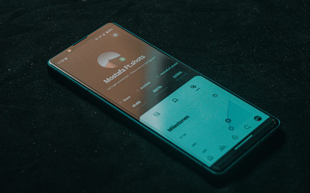
Dark Mode vs. Light Mode: Design Best Practices for Modern Interfaces
In the realm of modern digital product design, the battle between “Light Mode” and “Dark Mode” is no longer just a trend—it is a core functional requirement. Your users spend hours interacting with your digital platforms, and their preference for interface brightness significantly impacts their comfort, focus, and overall experience.
At SOUTECH Multimedia, we view theme selection not as a binary choice, but as an opportunity to enhance usability and reflect the high-end, professional identity of your brand. Whether you are managing an internal management system or a public-facing platform, here is our guide to mastering the dual-theme aesthetic.
The Psychology of Theme Choice
Choosing between light and dark is more than a matter of personal taste; it’s about context and physiological impact.
-
Light Mode (The “High-Focus” Environment): Light backgrounds with dark text are the gold standard for reading-intensive tasks. They mimic the experience of ink on paper, making them ideal for academic portals, data-heavy dashboards, and content-rich documentation.
-
Dark Mode (The “Reduced-Fatigue” Environment): Dark themes—specifically those that use deep grays rather than pure black—significantly reduce blue light exposure, mitigate eye strain in low-light conditions, and preserve battery life on OLED displays. They are perfect for long-term usage, creative tools, and entertainment platforms.
Best Practices for Modern Interface Design
At SOUTECH, when we develop custom software for our clients, we don’t just “invert colors.” We design two distinct, cohesive design systems that work harmoniously. Here are the principles we follow:
1. Avoid “Pure” Black and White
A common rookie mistake is using pure #000000 (black) and #FFFFFF (white). High-contrast pairings can cause “halos” or text vibration, leading to rapid eye fatigue.
-
The Pro Approach: For Dark Mode, use dark grays (e.g.,
#121212or#1E1E1E) as your base. These colors feel “deeper” and more professional. For text, use off-white or soft grays to reduce harshness.
2. Maintain Visual Hierarchy through Elevation
In Light Mode, we use shadows to show that an element (like a card or a button) is “elevated” above the background. In Dark Mode, shadows are barely visible.
-
The Pro Approach: Instead of shadows, use surface lightness. Elements that are closer to the user should be a lighter shade of gray than the background. This creates a clear sense of depth and hierarchy without relying on shadows that disappear against a dark background.
3. Adjust Color Saturation
Colors that look vibrant and readable on a white background often appear neon and aggressive on a dark background.
-
The Pro Approach: When transitioning from Light to Dark Mode, shift your primary brand colors to be slightly less saturated. This ensures that your call-to-action (CTA) buttons stand out clearly without causing visual discomfort.
4. Provide Manual Control
Never force a theme on your user. Accessibility is about choice. Always provide a persistent, easily accessible toggle that respects the user’s system-level preferences while allowing them to override it at any time.
Why Your Business Needs a Dual-Theme Strategy
If your platform is still strictly “Light Mode,” you are missing a chance to build brand loyalty through user comfort.
-
Increased Session Length: By allowing users to switch to Dark Mode, you reduce eye fatigue, encouraging them to spend more time working within your application.
-
Professional Perception: A platform that adapts to the user’s environment feels like a premium, modern piece of software. It signals that your organization is detail-oriented and tech-forward.
-
Accessibility Compliance: Many users with visual impairments prefer specific contrast ratios that only one mode might provide. A dual-theme system makes your platform more inclusive.
The SOUTECH Multimedia Approach
At SOUTECH Multimedia, we build interfaces that look incredible in both light and dark environments. We don’t just “apply a filter”; we engineer a theme-responsive design system from the ground up:
-
Design-First Prototyping: We prototype in both modes during the wireframing phase to ensure that no contrast issues exist.
-
CSS Variable Management: We utilize advanced CSS custom properties that allow us to switch entire color palettes instantly, keeping your brand identity consistent across themes.
-
Responsive Testing: We ensure that our UI components, icons, and data visualizations retain their legibility and aesthetic integrity regardless of the active theme.
Let’s Design for Every Environment
Is your current software or website adaptable to the modern user’s lifestyle? If you want to elevate your digital presence with high-end, responsive design that looks as good in the boardroom as it does in a dimly lit office, the team at SOUTECH is ready.
Build a platform that your users will love to look at.
-
View Our Portfolio: Visit soutechmultimedia.com to see our approach to modern UI design.
-
Let’s Collaborate: Contact us to discuss your project’s design requirements and theme strategy.
-
Upgrade Your Interface: Let us audit your platform and implement a seamless, high-end theme toggle.